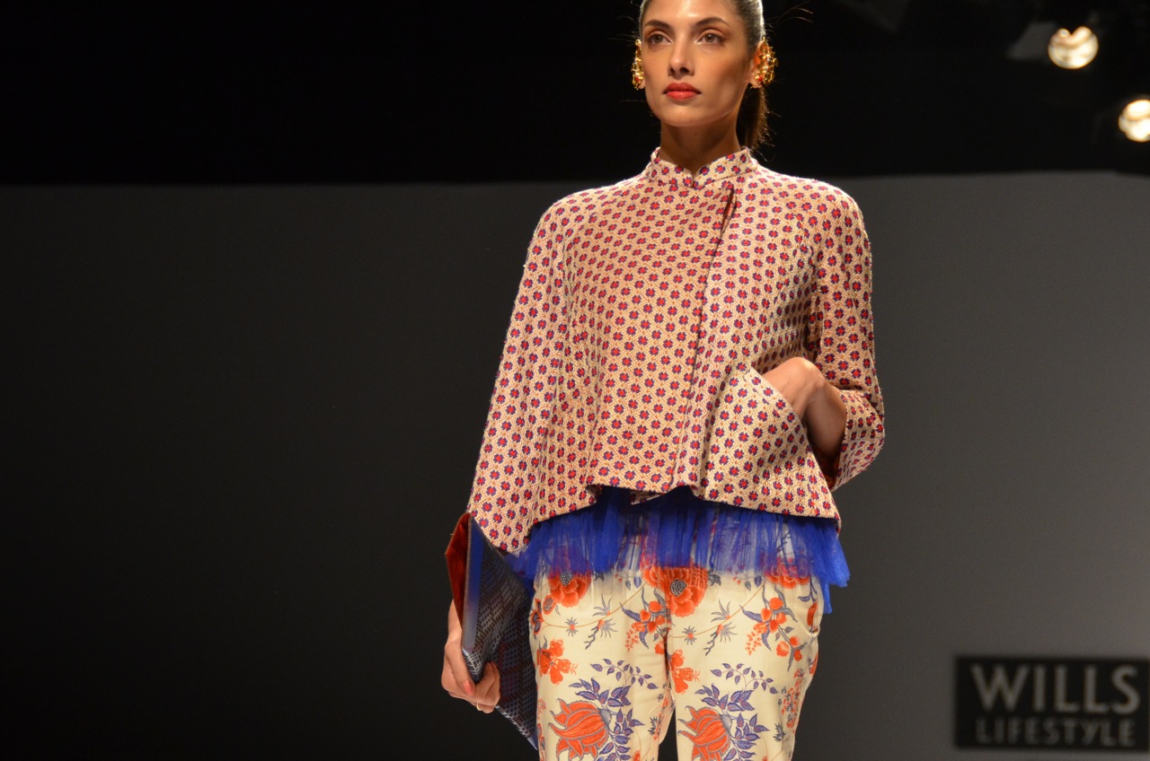
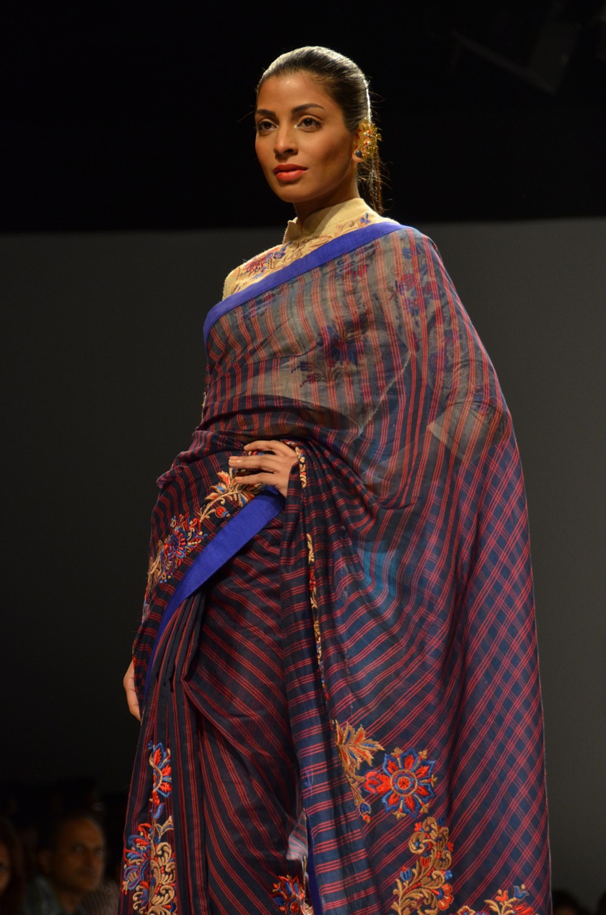
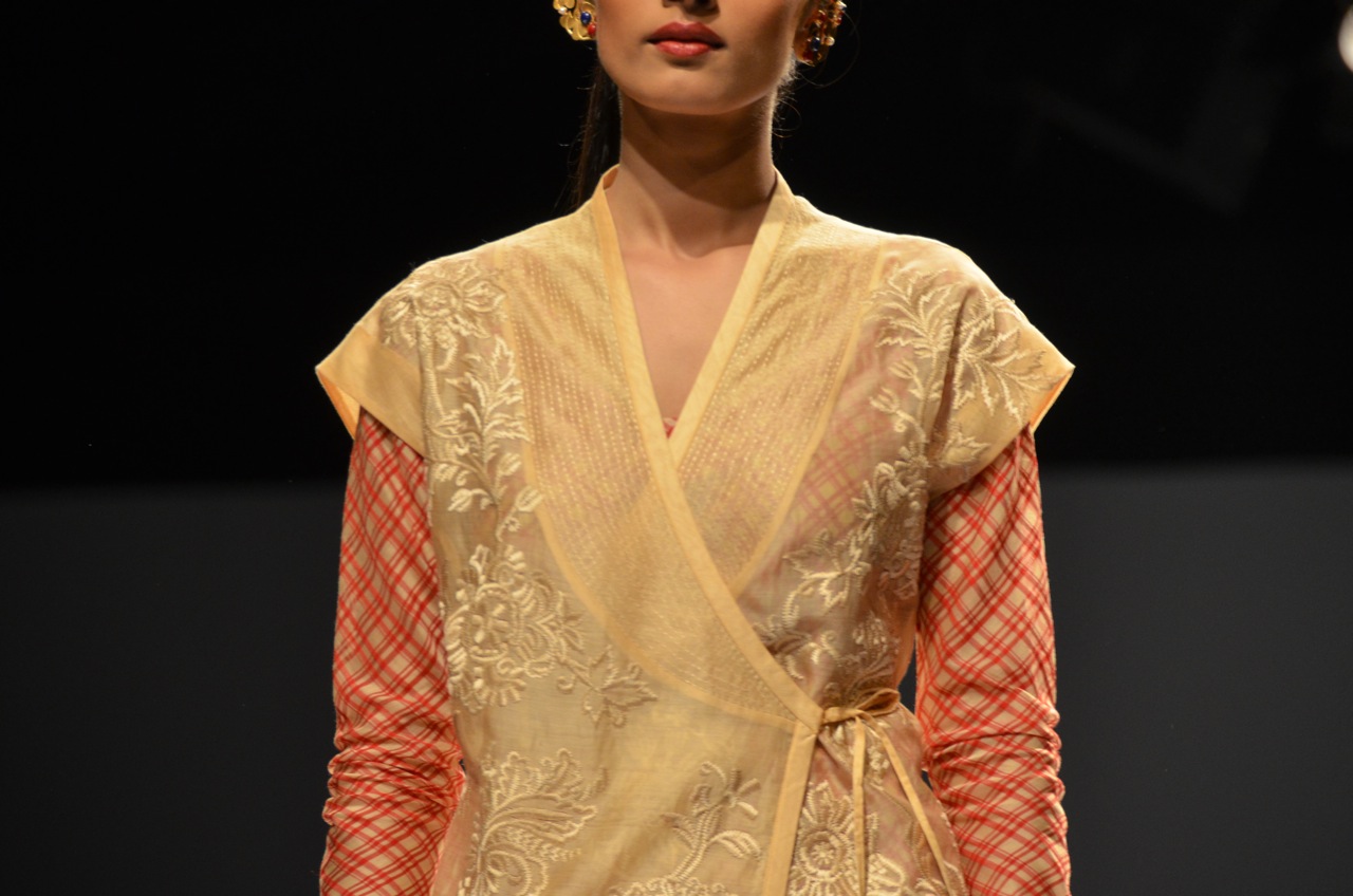
Payal Pratap’s S/S 2014 collection requires little explanation as the images and details speak for themselves. It was a show that all on Day#3 of WLIFW were eagerly awaiting, as over the past few seasons she has successfully built a strong following for the way she combines Indian textiles, colors, prints and embellishments. Her designs borrow from familiar Indian silhouettes, garments and styles of layering, and she understands well India’s love of mix and match as well as the need for modesty and morality in dress.

In this collection in particular the play on primary colors (red, blue and a various versions of yellow) was fun to see and also admirable as it is not always easy to execute in a sophisticated manner. The garments were simple, and the designer’s input lay in the way they had been combined (styled, mixed and matched), the fabric choices and the details.

While it was categorized as Spring Summer, it was perhaps more suited to spring evenings or an air-conditioned summer – if worn in the way they appeared on ramp. Taken apart, however, it is easy to see how one could dress certain items up or down, to create multiple as well as more casual looks – and indeed wear them all year round. To affirm this observation, Vogue India’s review of Payal Pratap’s S/S 2014 collection not only congratulates her on designing for the working [modern Indian] woman but also for catering to another long established Indian expectation of – paisa vasool (getting one’s money worth, bang for your buck).


(All images are taken by me.)
