Ruppee01vs

Black Out (2017)

Exactly one year ago, on November 8th, 2016, as much of the world was focused on the US presidential elections, India’s Prime Minister Narendra Modi announced the demonetization of all ₹500 and ₹1,000 banknotes via a live televised address.

Not one to take things slow, these two denominations of paper currency were to become invalid past midnight the following day, after which they could only be exchanged for legal tender at the local banks and a select handful of institutions.

Targeted at flushing out the millions of rupees worth of black money stashed away by tax evading individuals across the Indian subcontinent and beyond, this unprecedented move had many unintended negative outcomes—most of which hurt the vast majorities of low income communities and individual living below the poverty line who rely on cash transactions for their daily livelihood. The days and months following this announcement saw severe cash shortages and Indians struggled with the adjustment to digital/new bank systems. Multiple stories about the worthlessness of what was there (old notes), shortage and short comings of the new ones (the new ₹2000 paper notes were just too big a denomination for many to use, poor design and lack of color fastness of the new pink banknotes), and the unforeseen casualties of all this were gathering momentum.

Of course, there were a few short lived positive outcomes (such as the impact on the sex trade industry, Indian gangs, etc.), as well as some long-term ones that are only just being scrutinized a year later… but for the most part, much like the US elections, this was a rocky time that many would be happy to erase from their memory.

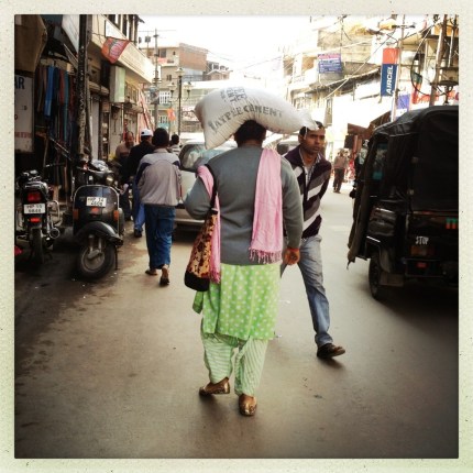
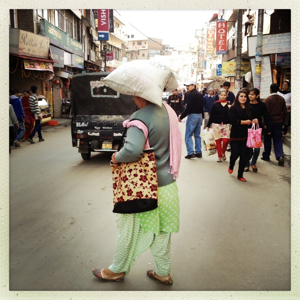
As an Indian national living abroad (in Chicago) at this time, the distraction from the political reality unfolding in the US was on one hand welcome… but it was also surreal to be aware of and deeply concerned about the sheer magnitude of the impact of demonetization and yet see no impact of it on my day to day life.

Well, no real impact beyond the few ₹500 banknotes I had in my travel wallet—roughly 100$ worth—a ballpark amount I’ve always travelled back with to ensure cash on arrival for my next visit to India. I suppose I could have enquired about exchanging the money at my local Chicago bank—but turns out that wouldn’t have worked anyway. The only option open to me then was to return to India before March 2017 to return my 100$ worth of rupees, or send it via a friend or family members travelling to India (to perhaps do the same). Neither were possibilities for me at the time, especially for such small refund of rupees.

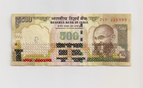
So, in the days following, I began to feel mildly irritated about the 14 bank notes I had with me—that had up till recently held real value, but now were worthless pieces of paper. It was hard to come to terms with that transition, as visually they held all the markings of authentic money. While I had resigned to the fact that I wasn’t going to be able to exchange them for real money, it was hard to think of throwing them away, even if they had no value anymore!

Then looking at these pieces of paper closely, I thought of the memories associated with their monetary value. For me these included shopping for textiles and crafts, for example. Or the time our maid was stealing cash from me, and the heartbreak and rift in my family that caused. Then I noted (hah!) the smaller details in the design of the currency notes themselves. The strange flourishes, the motifs that acted as markers of national identity, strange combinations of fonts, reference to Indian history, inclusion of watermarks, etc. —all of which contributed to the transformation of paper into money (that was now just paper again).

Also, each note “promised to pay” its said value—“well not anymore!,” I thought.

It seemed natural then for me to do something with this money. I couldn’t just throw it away!? That was too wasteful and I couldn’t ignore how painful this demonetization process had been for so many Indians… even if it didn’t impact me personally.

On embroidering “money”

Ruppee02vs

Glitched (2017)

Okay, so my mind knew it was not real money anymore, but for the last 37 years of my life those currency notes (or their previous iterations) had been REAL MONEY. Also, ₹7000 was and still is no paltry amount (especially if you think my expectation of prices in India remain fixed from my year of migration). So of course, I felt awkward about poking holes with needles through the notes. I was also aware that I only had 14 of them in total (2 more were added later by my cousin Rohit).

All of a sudden their value shifted again, and they became precious material. A very limited resource. I couldn’t waste any, couldn’t slip up.

Embroidering paper is harder than it looks. Making a series of holes—a line of small perforations—inevitably leads to tears. So, I reinforced the paper with fusible interfacing. In addition, to reduce mistakes, I carefully mapped out each piece by drawing on photocopies of the banknotes (is this illegal I thought!?) and practiced some of my embroidery techniques on a still valid, but not very valuable ₹10 banknote.

Ruppee03vs

Tracks of His Tears (2017)

In some of the pieces I’ve completed so far (see Images 1-3: Black Out, Glitched, Tracks of His Tears) I was simply trying to remove the monetary markings or glitching part of the note through cross stitch. But as the pieces evolve, (Image 3 and Image 4: Achhe Din..) I hope to explore some more ideas, which will invariably include some cheesy ones. The results of US elections helped propel me into working on a few notes last year and at the start of this year, but big life changes meant my work has halted for now. Although, I sense I’m ready to pick on embroidering them again!!

Ruppee04vs

Image 4: Achhe Din… (Good Days…, 2017)

Overall, my hope is that through embroidering these now worthless pieces of paper I can imbue value back into them, which, fingers crossed, is more than the 7.35$ (roughly) they were worth originally!

Enjoy!


SaveSave

SaveSave

SaveSave

After many years of research, writing and re-writing (which also included a break to welcome our new baby Liam) Indian Fashion: Tradition, Innovation, Style is finally out in print!

Cover Image: Rahul Mishra, S/S 2011

This journey began with some early papers I wrote on fashion and the Indian middle class and Indian fashion magazines – presented at conferences while I was teaching design at Massey University in New Zealand. Back then (I’m talking of 2005) I would find little in terms of academic research on Indian fashion. Emma Tarlo’s Clothing Matters: Dress and Identity in India (an invaluable text) along with a few journal articles and chapters here and there were all that I could access that directly related to “fashion” and India. To find these one had to wade through masses of writings on the sari that also referred to it and all other forms of Indian traditional dress as “costume”.

My decision to turn my research into a full-fledged book proposal came about in response to this lack of academic discussion (then) on Indian fashion, as well as my awareness of the vibrant fashion scene I had witnessed (and once been a part of) in India, contrasted with the general unawareness of this fact outside of India. Now of course things are different—thanks to Berg/Bloomsbury and other such publishers’ support for authors and texts on non-Western fashion as well as much more academic interest in these areas (evident at the recent Contemporary South Asian Youth Cultures and Fashion Symposium held at LCF, London in Sept 2014—where for once I felt like my paper on Indian Streetstyle fitted the conference agenda!).

As highlighted in the book’s preface, Indian Fashion attempts to offer a broad overview on fashion in India and in doing so (as I’m sure many will agree) it leaves out a lot of detail. While I acknowledge this fact, as well as my lack of prior academic training (I have two fairly traditional design degrees that have brought me to this point in my career) my hope is that this text will compliment others that do indeed provide more in-depth discussions on various topics that I introduce and touch upon in the book. While not everyone will agree with certain aspects of my discussion in the book or in some cases my overall approach, I am certain that the key ideas and concepts it builds upon—such as the the impact of globalization on Indian dress, the co-existence of tradition and modernity, various strategies of design innovation and self-fashioning, and the resurgence of nationalist ideals and revival of Indian crafts and textiles in fashion design, to name but a few—should undoubtedly remain valuable points of reference. Also, through my own design training and years of teaching fashion design studio, I am confident that the images that support the book’s discussion accurately represent the dynamism evident in various the design innovations currently underway within the arena of Indian fashion—on the catwalk, in print, in the media, in film, on television and on multiple style blogs.

I am grateful to many people for their input and support as I worked on this book and I include here an excerpt from the book’s acknowledgements: “Many invaluable discussions on fashion with Asha Baxi were central to the inception of this book’s research. I am indebted to Shefalee Vasudev for sharing her deep insight on fashion in India as well as assisting me in approaching various members within the fashion industry. Several people generously gave their time and thoughts across numerous interviews and informal chats through the course of my research that have helped enrich the content in this book. I am deeply grateful to these wonderful and dynamic fashion professionals: Yatan Ahluwalia, Aneeth Arora (Péro), Sonu Bohra and Jasleen Kaur Gupta (FashionBombay.com), Meher Castelino, Neeraj Chauhan and Alpana Mittal, Anjali Chawla, Kallol Datta, RK Deora, Anita Dongre, Swarup Dutta, Rohit Gandhi and Rahul Khanna, Sanjay Garg (Raw Mango), Gaurav Gupta, Amit Hansraj, Hemani Kashikar, Sangita Kathiwada, Vinod Kaul, Azeem Khan, Tarun Khiwal, Heena Kochhar, Narendra Kumar, Ritu Kumar, Ritu Kumar (O’Layla), Neeta Lulla, Gaurav Mahajan, Nida Mahmood, Manou (wearabout), Rahul Mishra, Anju Modi, Pavitra Mohan (Masala Chai), Puja Nayyar, Nazarul, Ekta Rajani, Nihal Rajan, Rajdeep Ranawat, Wendell Rodricks, Harilein Sabarwal, Priya Sachdev, Nitin Saxena, Mehul and Kaushik Shrimanker, Mandira Shukla, Sujata Assomull Sippy, Geetika Srivastava, Manasi Scott, Rajiv Takru and JJ Valaya. Additional thanks to Vineeta Nair, Savitri Ramaiah, Vinayak Razdan and Shalini Singh, and all those who generously contributed towards the book’s images – as outlined in the image credits. My field research in Mumbai would not have been possible without my sister Tarana Singh’s determination, endless enthusiasm and driving skills. I would also like to thank the Fashion Design Council of India (FDCI) for allowing me access to attend Pearls Infrastructure Delhi Couture Week (in 2010) and Wills Lifestyle India Fashion Week (WLIFW, 2013). 

The thoughtful and thorough review notes provided by the anonymous reviewer on the initial manuscript as well as those from earlier anonymous reviews at the proposal stage helped strengthen the premise of the book. In addition, the texts edits and feedback provided by Lilian Mutsaers, Maren Nelson, Debra Parr, Shefalee Vasudev, Simon Holland and Param Sandhu – who were subject to various stages of the book’s rough drafts – were an invaluable and important part of its evolution. Furthermore, this project could not have been completed without Columbia College Chicago’s faculty development grants that funded various segments of field research and the supportive environment within the Fashion Studies department, chaired by Debra Parr, that allowed me the time and resources required for the preparation of the final manuscript.”

Being solely responsible for almost all the image acquisitions and permissions for this book was also no easy task. Numerous people helped me secure valuable images from designers, magazines, TV shows and movies for this book. While some are mentioned in the list above as well as in the list of illustrations (in the book) I would like to extend a big “thank you” to various PR representatives of the designers and brands featured, the designers themselves, individual photographers, film and TV channel reps, as well as the editors of Vogue India, Elle India, Marie Claire India and Harper’s Bazaar India. In many cases hunting for images (such as the one from Bombay Dyeing or one from a old issue of Femina magazine that did not get published) was akin to being a detective – and I will write about some of these experiences in another blog post.

And finally on a more personal note: “This book is dedicated to my husband, Simon Holland, whose patient and selfless support over the years made it possible to complete. Also included in this dedication are my parents, Amrita Sandhu and Deshvir Sandhu, who never questioned my decision to study fashion design at a time when it was a relatively new field in India. Together they have served as devoted research assistants throughout my field research in Delhi. In addition to diligently mailing me Indian fashion magazines across the world over many years, Amrita Sandhu has also provided majority of the images in Chapter 2.”

Cover Image: Rahul Mishra, S/S 2011

photo3

Up until a few years ago Mehar Chand market was not only known for its tailors but also for the creative names some of the tailoring establishments had and their quirky slogans. It is estimated that there were once at least 75 tailors in this area, and some, as the sign indicates, could create wonders – whether it be in the making of new clothes, or mending old well-loved threads.

This year I only noticed one such tailor – OM Tailors. Though I only walked halfway up the market… perhaps there are a few more left – nestled amongst the newer upmarket fashion boutiques and quirky interiors stores.

AAP's Gandhi topi - printed text reads 'I Am The Common Man' followed by the election symbol of the broom

As Delhi gears up for its legislative assembly elections tomorrow (Dec 4), a small group of political campaigners for the AAP caught my interest as they were handing out Gandhi topis at Janpath the other day.

The AAP or the Aam Admi Party (Common Man’s Party), for those who may not know, is led by Arwind Kejriwal and is an off-shoot of the India Against Corruption movement initiated by Anna Hazare in 2011 (from whom Kejriwal parted ways in pursuit of a political direction for the movement’s ideals). AAP’s party symbol is the broom (jadhu) and its key goal is, for lack of better words, to ‘clean up’ the corruption currently present at almost every rung of Indian politics and within a plethora of government bodies. As the party’s title suggests its aim is also to serve the common man – who in a country like India suffers tremendously due to rampant corruption as well as the extreme polarity between the rich and the poor.

photo 2

In my albeit politically inexperienced opinion, at times it is unclear as to who this ideal common man is for the AAP – as on one hand they hope to uplift those belonging to the lower and laboring classes but in doing so rely on the support of the middle-class to succeed (who in turn are also in desperate need of less corrupt system of governance and a less onerous system of bureaucracy). While the common factor is corruption, both these segments of society have different needs, and in the current context the party has come under criticism for being out of sync of the hopes and expectations of a growing middle-class charged with India’s economic progress within a globalized digital age.

Coming back to the purpose of this post, what caught my eye is the way in which the AAP has once again employed an iconic piece of clothing – the Gandhi topi  – as a political symbol and visual medium for connecting with these two mismatched segments of Indian society during this election.

The topi, named after Mahatma Gandhi – who is said to have first worn such a piece of headgear in 1919 at the Amritsar Congress (Bean 1989) – has a long-standing relationship with politics and political movements in India. Even though Gandhi himself wore it only briefly, he actively promoted it as a symbol of rebellion and swadeshi ideals. Though its exact sartorial roots are unclear, it is thought to have been inspired by caps worn in South Africa and/or similar to a Persian style as well as various styles of caps worn across India at the time. The topi was an effective symbol not only because of the importance given to the practice of head covering by various religious groups in India (Cohn 1989), but also because it acted as a powerful visual tool that could communicate beyond language, regional and societal barriers to help unify otherwise distinct groups of people towards a common cause. The wearing of the topi became popularized around the time of the freedom struggle and greatly irked the British when worn by Indian officials and subordinates (ibid). It became associated with political leadership subsequent to India’s independence and a number of politcial leaders continue to wear it to this day. It is also worn widely across India by farmers, rural officials and the RSS, for example, and is even a part of the uniform of Mumbai’s infamous dabbawallahs.

While the Gandhi topi was originally made and constructed from khadi, which was in keeping with with swadeshi movment, the topis AAP’s representatives were handing out were mostly made from a recyclable non-woven polypropylene material. Here it is interesting to note that despite the evolution in the materiality of the topi (from woven to non-woven, natural fibers to manmade) its political symbolism and intent has remained intact.

My conversations with many rickshaw drivers while navigating through Delhi this past week highlighted a growing support for the party. Whether this will be a new chapter for Indian politics only time will tell, but it most certainly is a new addition in story of symbolism of cloth and clothing in India.

photo 1

The line between buildings (commercial and residential) and advertising often gets blurred in India – as the latter acts as an outer skin in the form of painted hoardings on shops, houses and abandoned buildings on main roads and highways. There are times when these hoardings take over long stretches of national road networks and in some cases entire villages. Some find this visual encroachment extremely ugly while others (like myself) are able find a sense of beauty in the way they add to the built environment as well as the overall landscape.

Josh2

Majority of these signs and hoardings continue to be hand-painted as opposed to digital printouts. I’m not sure how long this practice of painting walls will continue, but while it does these advertising strategies ensure buildings get a fresh coat of paint every few years. As there are also subtle variations within each iteration, which include [creative] spelling mistakes and other slight anomalies – these serve as reminders of obvious traces and imperfections of the human hand – that ultimately have their own charm.

I also find it interesting to observe how over the years as certain brands gain prominence and amp up their advertising strategies while others fade from view, these buildings also shift and change their colors and patterns to mimic the trends. In 2010 most of the buildings around the area from where this set of images were taken were red (Vodafone, ACC and Coca-Cola), as well as blue (Reliance) and yellow (Ambuja Cement), but now there are other brands that appear to be more prominent. When viewed collectively this also means that a significant change in the landscape of a town or village even though the overall constructions remain the same.

Pictured in this post are some images of Josh (which literally means spirit, vigor) baniyan (sleeveless undershirt) and underwear (by Dixcy) ads from the main highway near Solan Brewery in Himachal Pradesh.

Josh4

Additionally, the image below in particular is one instance when it is possible to read the placement of images and text on houses and buildings in ways that go beyond their intended message. In this case lace trimmed underwear painted on a locked but slightly ajar door makes for an interesting read in the context of dress and morality in India.

Josh3

I’m reblogging a post from my tumblr site – as this crossed into both domains. The images below are a wonderful example of how old and new – in this case methods of carrying things – can co-exist. It was not easy to catch up to this lady as she was walking very fast through Solan’s chaotic pedestrian and vehicular traffic. I was not able to stop her, which is sad, as seeing her with a nice flower print bag, dotted and striped salwar kameez, shiny punjabi juttis and a bag of cement on her head made me wonder what events had led to the combination of these items of dress.

20131108-192308.jpg

20131108-192256.jpg


(Click here if you only want see pictures of Péro from Wills Lifestyle India Fashion Week)

Aneeth Arora is one Indian designer for whom I feel tremendous respect – as through seeing her clothes it is easy to read how committed she is towards creating pieces that tell a story, pieces that are more than just faddish fashion, pieces that one can fall in love with – to create fashion that has a conscience. Though I maintain an objective stance in how I discuss her work in more scholarly formats (for example in the book I am working on), personally I admire her work ethic and the aesthetic of her designs.

PeroSS2014.WLIFW03

PeroSS2014.WLIFW07

For those who are not familiar with Aneeth Arora or her label Péro– the name means ‘to wear’ in Marwari. More importantly however, over the past few years, her label has come to be synonymous with beautifully handmade, handcrafted pieces that, as I have said in an earlier post, could also be categorized under the title of sustainable design. This is because Aneeth tends to design garments where fit and trends are secondary, and craft and the emotional connect a wearer has with their clothes is primary. The style and shape of her clothing tends to follow classic unfitted cuts that allow the textiles to take center stage. For those who value such an approach, Aneeth’s garments become truly well-loved keepsakes. Additionally Aneeth is also conscious about ensuring her interactions with craftspeople and their products compliments the cultural history and aesthetic evolution of the craft itself. In other words, she does not tamper with the visual identity of the craft. Instead her injection of design innovation lies in subtle color, proportion and fiber related modifications, and she strives to use the same crafts and craftspeople across her collections, over multiple seasons; as opposed to fashionalizing a certain technique, region and craft for one season or for the sake of a theme, only to abandon it for the next season. In doing so she respects the timelines and risks that craft processes entail that do not follow fashion’s tights schedules.

As a result one could say that Aneeth, and designers of her ilk have successfully subverted some of the traditional frameworks of fashion that we have all come to be familiar with (i.e. by being opposed to fast fashion, side stepping seasonal fads, fashions shows – see Raw Mango). I believe these are all important steps in the trajectory of Indian design and fashion towards asserting and establishing itself as a legitimate global fashion center, with its local frameworks and visual identity.

When I first saw her designs in 2010, selling at Ogaan, I almost had to sit down and take a moment as even though aspects of the garments were culturally familiar to me (the textiles, the hand finishes and the Kedia like cuts for example) I had not seen anything like that before in relation to Indian fashion and designer wear till that point. I immediately recognized the love in the clothes – which is now literally communicated in her “labour of love” line – where a small heart embroidered on the garment indicates its hundred percent handmade-with-love status. Aneeth has researched, recreated and preserved numerous techniques of hand finishing practiced across India, such as Bakhiya (a type of back stitch from Gujarat), daraz (a decorative seam stitch from Lucknow), various darning techniques and kantha stitches and brought them into the fold – teaching and training, and through this supporting a number of women, who, in her own words, are a part of the Péro family.

PeroSS2014.WLIFW05

PeroSS2014.WLIFW04

PeroSS2014.WLIFW10

PeroSS2014.WLIFW06

Alongside the labour of love line, Aneeth also showcased her S/S 2014 collection at Wills Lifestyle India Fashion Week (October 2013) for which another overarching theme was polka dots. Dots that had been sourced from a variety textile crafts practiced across India – Ikat, Chanderi, block printing, to name a few. A brilliant concept. Best enjoyed through a close inspection of the clothing – where dots and spots of different sizes, textures and techniques had been combined together and then contrasted with floral prints, checks, crochet and lace.

PeroSS2014.WLIFW12

PeroSS2014.WLIFW13

Beyond doubt, Aneeth’s show was one I was most looking forward to see at WLIFW (and have since thought most about). Besides the two points of emphasis (labour of love and dots) the catwalk performance had an early 20th century English-tea-party meets enchanted-garden theme. The collection had been accessorized with straw hats and hand embroidered and beaded English-styled purses, along with more contemporary injections of silver and pink shimmer boots and shoes. The garments were indulgently layered and unkempt – Aneeth’s signature.

PeroSS2014.WLIFW14

PeroSS2014.WLIFW15

PeroSS2014.WLIFW27

PeroSS2014.WLIFW28

PeroSS2014.WLIFW20

It is here that some of those who attended Aneeth’s show experienced a loss in translation, as the presentation of the garments undermined the depth in them (too pretty, too whimsical some said); while others responded positively to the designer’s vision, and attempt to indulgently lure the attendees into this vision.

In my case, I had foolishly (and greedily) visited her stall many times over the few days that I was at WLIFW, each time discovering new details (seams, hearts and dots) in the garments with a shameless sense of glee. So it was obvious that seeing them in such a detached format, on a ramp, was not as fulfilling an experience as seeing them up close. Indeed fashion shows can be limiting formats for communicating the subtlety of detail that I associate with Péro. Additionally, over time, it is easy to become weary of references to an idealized past that lies outside of the Indian reality, and in the West (the 20s, 50s, Romantic period, 70s, Paris, Spain etc.) – a common fact that Antonia Finnane also mentions as being popular in the context of Chinese fashion (Finnane 2008). This can be jarring at first, and it is easy to dismiss as blind mimicry; and to expect something more original or Indian in comparison. However, on closer inspection, especially in the scene unfolding in the background on the ramp, where a sari clad lady enjoys cupcakes and macaroons, sipping on what must be Earl Grey or English Breakfast tea, the subversion of the idealized Western image is worth noting.

PeroSS2014.WLIFW21

My only wish was for this to have been explored more deeply in the presentation – as it was reminiscent of the accounts I have read of Indian women and men during the turn of the last century, caught between dilemmas of maintaining traditional values and garb alongside the Western influences of the time, and their unique strategies of mix and match. And through these strategies asserting their own identities. In fact the sari as we know it in its most popular form is a result of such creative and cultural negotiations. (Sounds familiar?)

Here I was also reminded of my grandmother who continued to wear a sari throughout her life, but her exposure to Western lifestyles (ballroom dancing, English scones etc) and colleagues in the early 20th century meant that she too owned a fur muff, an ivory fan, lace parasol, many items that had been needle-worked by her and wore gloves when she shook hands with her majesty the Queen at the Taj Mahal. There were many grand ladies like her during her time, who I’m sure felt like cultural misfits on many occasions, but lived their lives gracefully and creatively nonetheless. This connection was a wonderful discovery for me, that was only made possible through more reflection about the show (not to mention I had some wonderful images as reference points).

PeroSS2014.WLIFW18

Another unnoticed fact (perhaps someone has written about this already) is the irony of how Aneeth recreated nostalgia of and for the West through using Indian handlooms – could this along with her unkempt saris worn with boots be linked to theories of fashion and postmodernist pastiche? Aneeth may have been touching upon these factors in this show – but could have brought them to the forefront. Or perhaps opted for the straight, no-frills catwalk like Dev R Nil – and let the clothes speak for themselves? Either ways, I look forward to what she designs next!

PeroSS2014.WLIFW25

PeroSS2014.WLIFW22

PeroSS2014.WLIFW26

More images from the show here

Photo gallery for those who may be keen to see more of my photographs from Péro, and skip the rambling post above. Click on one image to see the set in a slideshow format.

While the gorgeous colors, layers, prints and embellishments were a treat to see at Wills Lifestyle India Fashion Week S/S 2014, Bodice’s minimal collection – that emphasized simplicity through subtle detailing borrowed from men’s tailoring and comfortable cuts – came across as a breath of fresh cool air.

BodiceSS2014.WLIFW03

BodiceSS2014.WLIFW12

Some might say that minimalism sticks out like a sore thumb in Indian fashion. It is common knowledge that bridal and occasion wear accounts for the majority of popular tastes and sales in designer fashion, especially in the north. Yet, if one considers India’s design history post-independence as well as some of the crafts that have evolved here over the centuries – there is plenty of evidence of simple, subtle design existing alongside our other more maximalist tendencies.

Hailed as a key player amongst India’s emerging group of globally minded design labels as well as a proponent for the anti-glamour movement – Ruchika’s Sachdev’s Bodice offers urban fashionistas the space to rebel against fussy details and fitted OTT (over the top) fashion. However, if one goes by the experience of other more seasoned designers already in this niche simplicity can be a challenging concept to convince Indian consumers of – consumers who are often looking for a visible return for their investments (I mentioned paisa vasool in an earlier post). I noted some comments online following the show that questioned how these garments were fashion, comments that critiqued their fit and failed to see any innovation in them. Bringing minimalism back or forward, depending on how you view it, into the mainstream of fashion in India will require a cultural shift in how clothes are viewed, worn, consumed, valued etc.

I am keen to see how this space evolves.

BodiceSS2014.WLIFW18

BodiceSS2014.WLIFW10

BodiceSS2014.WLIFW09

BodiceSS2014.WLIFW02

A more complete set of images taken by me at the show here:

This slideshow requires JavaScript.

Small photo break from the whirlwind experience that was India Fashion Week:

Seeing the beautiful garments and designs up close at WLIFW also made me think about the importance of dry cleaners in the appreciation of fashion in India. Here’s the beginning of a photoset on dry cleaner displays…