Archives for posts with tag: Yellow

The line between buildings (commercial and residential) and advertising often gets blurred in India – as the latter acts as an outer skin in the form of painted hoardings on shops, houses and abandoned buildings on main roads and highways. There are times when these hoardings take over long stretches of national road networks and in some cases entire villages. Some find this visual encroachment extremely ugly while others (like myself) are able find a sense of beauty in the way they add to the built environment as well as the overall landscape.

Josh2

Majority of these signs and hoardings continue to be hand-painted as opposed to digital printouts. I’m not sure how long this practice of painting walls will continue, but while it does these advertising strategies ensure buildings get a fresh coat of paint every few years. As there are also subtle variations within each iteration, which include [creative] spelling mistakes and other slight anomalies – these serve as reminders of obvious traces and imperfections of the human hand – that ultimately have their own charm.

I also find it interesting to observe how over the years as certain brands gain prominence and amp up their advertising strategies while others fade from view, these buildings also shift and change their colors and patterns to mimic the trends. In 2010 most of the buildings around the area from where this set of images were taken were red (Vodafone, ACC and Coca-Cola), as well as blue (Reliance) and yellow (Ambuja Cement), but now there are other brands that appear to be more prominent. When viewed collectively this also means that a significant change in the landscape of a town or village even though the overall constructions remain the same.

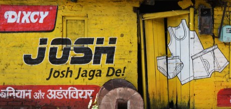
Pictured in this post are some images of Josh (which literally means spirit, vigor) baniyan (sleeveless undershirt) and underwear (by Dixcy) ads from the main highway near Solan Brewery in Himachal Pradesh.

Josh4

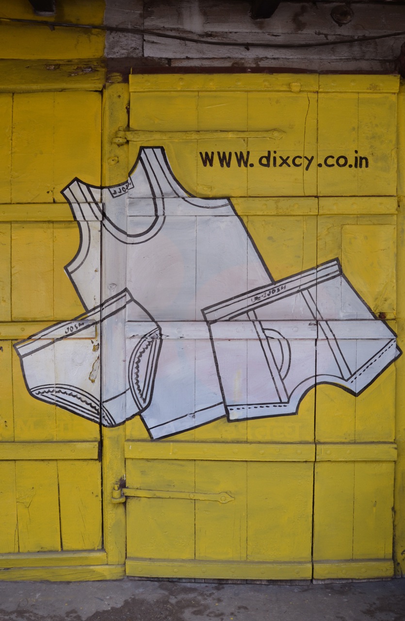
Additionally, the image below in particular is one instance when it is possible to read the placement of images and text on houses and buildings in ways that go beyond their intended message. In this case lace trimmed underwear painted on a locked but slightly ajar door makes for an interesting read in the context of dress and morality in India.

Josh3


PankajNidhi.SS2014.WLIFW30

Not having seen a Pankaj & Nidhi collection on the ramp before I was eagerly looking forward to seeing their new S/S 2014 line at WLIFW (10th October 2013). Together this design duo is part of the new wave of Indian designers who have in the past five+ years really changed the face of Indian fashion once again – bringing new ideas, styles and silhouettes, new techniques for applying centuries of tradition and handcraft and contributing towards bringing Indian design to a more global platform. The collection titled “Grammar of Ornament” was in keeping with their signature style – which includes a high level of craftsmanship, close attention to detail, bold use of color and pattern and strong silhouettes. The collection combined a sporty look (a common trend across a number of other collections) with some incredibly detailed handwork – that demanded closer attention – as on the catwalk I was not fully able to gauge what treatments and techniques they had used.

PankajNidhi.SS2014.WLIFW01

What appeared to be laser cut work or print from a distance – on closer inspection was actually delicately hand cut and perfectly hand embroidered pieces that in my opinion show the incredible limits to which Indian craftsmanship (with the injection of contemporary design) can be stretched.

PankajNidhi.SS2014.WLIFW03

The colors ranged from crisp whites and creams to primrose yellows and navy with hot coral. In comparison to some other collections on show Pankaj and Nidhi’s silhouettes were more globally oriented. And while they do design Indian styled garments, overall this collection did not appear to be culturally or aesthetically rooted [read limited] to one particular place (i.e. not recognizably Indian). This I know is important to them – as they aspire towards greater global recognition for themselves and Indian design – which their accomplishments over the past year+ clearly show.

Here is a selection of images from the ramp, as well as some others that I was able to take in their stall at WLIFW. See more in the gallery at the end of the page. From a design perspective I liked the cohesiveness of the collection, something I stress upon in my own studio classes. But within the cohesion there was a lot of variety to choose from. My personal favorites are the images of the pieces up-close, especially those of the tiny fabric squares that have been cut and sewn on like sequins, and the jacket where they combine Ari work with (hand) cutwork and appliqué. (Thank you Pankaj and Nidhi for allowing me to snoop around your collection!).

PankajNidhi.SS2014.WLIFW29

PankajNidhi.SS2014.WLIFW05

PankajNidhi.SS2014.WLIFW23

PankajNidhi.SS2014.WLIFW26

PankajNidhi.SS2014.WLIFW19

PankajNidhi.SS2014.WLIFW20

PankajNidhi.SS2014.WLIFW13

PankajNidhi.SS2014.WLIFW14

PankajNidhi.SS2014.WLIFW10

PankajNidhi.SS2014.WLIFW08

PankajNidhi.SS2014.WLIFW32

While speaking to Nidhi about these obviously time intensive and meticulous garments I asked her to consider sharing images or videos of the pieces in process – so that it is possible to better understand the kinds of techniques they have developed for their designs, as well as learn the stories behind each piece. I was glad to see that they have since uploaded some images on their facebook page sharing the same! Way to go!

This slideshow requires JavaScript.

Images by myself (Arti Sandhu)